Welcome to Polly's Blog

Welcome to Polly's Blog
Watercolour, humour, this and that
Showing posts with label Workshop. Show all posts

Saturday, 4 July 2015

COLOUR MIXING - WATERCOLOUR ( PART 1)

I recently held my very own workshop!!!  Yes, honest.  Talk about stress. But I heard in our little art club that people didn't know about warm and cool colours, transparent colours etc.  So, I plucked up the courage and gave it a go.

I was very influenced by two artists in particular.  Hazel Soan whose workshops and holidays I have been on and is the Queen of Colour Information, and Colin Ratcliffe who was a tutor at Higham Hall in the Lake District who passed on the setting out of your palette and separating cool from warm colours.

Here is just some of the information that may be of use to one or two of you.

FIRE & ICE Here’s the notorious colour wheel, that I like to think of as Fire and Ice. Bright reds and yellows against the iceberg colours, some colours veering towards fire and some towards ice. Eg. alizarin veers towards blue on the wheel where Ultramarine veers towards red.  I use mostly transparent colours to avoid mud.  I am going to ignore staining and non staining, and lifting colours, that’s another story!


BOOKS THAT I RECOMMEND BY HAZEL SOAN (QUEEN OF COLOUR).                                    
1. Collins 10 min Watercolours by Hazel Soan  (which explains all aspects of      watercolour, wet in wet/ colour mixing/ people etc) I think it’s great value for money.
2. Hazel Soan’s Watercolour Rainbow, which is a definitive watercolour ‘colour’ book.
3. Learn Watercolour Quickly – Hazel Soan (see chapter 3)

COLOUR  Cool veers to green/blue and Warm hints of red
Here’s my palette with warm colours separate from the cool, so I don’t have to think about where my cool colours are so that I don’t get a bright mix if I don’t want one.   Transparent colours are the darkest (apart from yellow), you can hardly tell what colour they are e.g. Pruss, alizarin and modern names like quinacridone and permanent.  Opaques are the lighter creamy colours and are heavier pigments, which makes them opaque you more likely to get mud. E.g. Cad Red. & Cobalt. Similar colours may be trans or opaque with different manufacturers so always check.


NB If you put 2 cool colours you will get bright mix, 2 warm a dull colour, cool and warm softer colour.  Will make sense I hope.

Tubes v half pans. Tubes are softer and easier to mix sometimes you have to scrub the half pans. But pans are easier to carry.  Best of both worlds I squeeze tubes into pans.

Artists v Students.  Colours are the same, main difference is the stronger pigment in the artists so you need less to mix your colours.


WATER
Control of water is most important. Lots of water and the paint moves and spreads more.
Less water and the paint won’t spread as far.  Lay lighter colour down first and add second colours alongside, same wetness, the second colour pushes away the first. If you want to add a deeper controlled colour like a spot, wait til the shine goes off the paper and drop in thicker paint, the thicker the less it will spread.

I recommend 2 pots of water, one for clean water, so you are less likely to get mud.

Big v small brush.  Large is quicker, looser, less control of water good for wet in wet.
Smaller brush need less water so more control, good for details at the end.

Be bold with your colours. Watercolour dries much dries lighter than you expect.

Milk, cream, butter are the consistencies of paint, from washes to laying in thick colour into an already wet wash.

COOL & WARM VARIANTS OF THE PRIMARY COLOURS
Cool Red                     Alizarin -          Perm. Rose
Warm Red                   Cad Red -         Vermillion, Pyrrol Scarlet (mostly opaque)
Cool Yellow                Aureolin -         Lemon Yellow (opaque), Transparent Yellow
Warm Yellow              Ind. Yellow -    Cad Yell, Hansa Yellow, New Gamboge
Cool Blue                    Pruss -               Pthalo Blue, Winsor Blue
Warm Blue                  Ultra -               Cobalt (opaque)
                                    Raw Sienna –    Cool
                                    Yell. Ochre  -    Warm (semi opaque)

COLOURS I CANNOT  DO WITHOUT


MISCELLANEOUS INFO

Try and have a limited palette when painting, it’s more harmonious and easier for colour mixing.

Opaques are useful at the end of the painting for highlights and for oomph.

2nd wash pushes away the first

Ways to mix your colours/put a dry layer over another dry layer on paper/blend on paper wet in wet/mix in your palette


List of Transparent/opaque/warm/cool/colour mixes (I treat semi opaque as opaque)

NB Some makes are slightly different so you need to check.  My notes are based mainly on Winsor & Newton.                                           

TRANSPARENT: (least likely to get mud if you use only transparent colours)
They’re darker and look almost black in your palette.

Warm Colours
Burnt Sienna
Burnt Umber
Indian Yellow
Sap Green
Ultramarine
                                                 
OPAQUE:  Chalky colours, more likely to cause muddy colours. Generally brighter in your palette       

Warm Colours
Cad. Orange
Cad. Red
Cad. Yellow
Cobalt Blue
Light Red                                            
Sepia
Yellow Ochre
                                   

Cool + Cool = Bright
Warm + Warm = Dull
Cool + Warm = Softer colour

Opaques are good for adding highlights and oomph at the end of the painting so don't ignore them!

 Cool Colours
Alizarin Crimson
Aureolin (Yellow)
Permanent Rose
Prussian Blue/Pthalo Blue
Raw Sienna
Raw Umber
Viridian

Cool Colours
Cerulean Blue
Indigo
Lemon Yellow
Paynes Grey    
Titanium White      

Here are the examples I asked them to try using their own mixes.  With some suggestions for colours which you might be able to read on the sample sheet.


Sorry my notes are a bit here and there, and in the end I have passed on to you most of my knowledge.  Hope it helps just one more person.

I will do another short post, with some suggested colour mixes.

.Remember you’re an artist like a musician or a poet.  You are here to entertain not record pictures exactly the same as a photograph, so take risks, change composition and colours. Let the colours flow into each other. Let your imagination run riot.  Have fun.  It’s playtime!
                                                                                                                                                                                                                           
Remember, if you always do what you’ve always done, you’ll always get what you’ve always got!                                                                                                                                                                                                                                                                                                                         

Wednesday, 24 June 2015

BRUSHO WITH JOANNE BOON THOMAS

I recently went to a workshop run by The Brusho Queen, Joanne Boon Thomas.  Very informative   but fun thrown in for good measure.  She is very generous with the information she passed on to us and is warm and friendly.  Here is a the work that we did.  They are on Half Imperial Langton Paper.

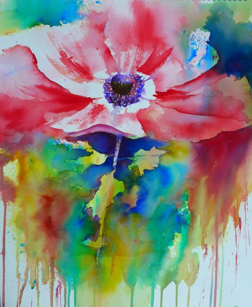
  Can't say the name of the flower but remember it is An Enemy - er really an anenome!  Some spraying technique and then used like like watercolour.  Such vibrant colours.


Just using two colours.  Turquoise and Orange! A tiny bit of  Ultra under and in the boat. Same method as above.

If you haven't heard of Brusho and would like to see it in action, you can find a video by Joanne Boon Thomas on Youtube and many of her painting on google.

Brusho is like dye crystals or ink, like salt, you can sprinkle and spray, use bleach and play with the paint or use like watercolour.  You can get effects with it that you can't with watercolour.  I call it my playtime when I use it.  Originally it was used for textiles.  It is also used in schools as it is non toxic. It does, however, stain your fingers temporarily, so I have to wear an apron, as I am a messy painter at the best of times.

Do check out her lovely work on google images, pinterest or visit www.artybyboon.co.uk.

Friday, 19 September 2014

HUMAN FIGURE WORKSHOP

You may have heard of Port Sunlight Village.  Well there is a gallery there of some repute!  To top it all they have had free workshops there this summer.  I have just been to the latest.  They have just had an exhibition concerning Rossetti's Obsession: Images of Jane Morris (his muse).  Beautiful drawings there were too.  Mostly pastel.

Hence the pastel workshop of the Human Form.  

We covered classical Greek and Roman dimensions, stick men, cylindrical men, shaded figures and finally a pastel painting of the tutor.  All in 3 hours.

Here are some of the working papers.

This is my sketch of Chris, a friend who went with me. 10 mins sketch

I love this, it is my frriend Martine's, drawing of me.

The classical dimensions and basic shapes.

My pastel drawing of the tutor.  His legs are faded out and not 5ft long!!  20 min sketch

I learnt such a lot in 3 hrs.  Steve Hersey was a very good teacher, and I thank him.


Have a wonderful weekend everyone.

Saturday, 16 August 2014

IMAGINARY FLOWER WORKSHOP

Most of you know my battle with 'enjoying' painting flowers.  Well I should have gone on a floral workshop for watercolours, which was unfortunately cancelled!

Undaunted, I set about making myself spend a day doing an imaginary workshop at home.  I looked at books (not copied from them) for inspiration and youtube too.  Here is what happened. I did 4 in a day, which is what I anticipated would have been done on the workshop proper.

First painting I did was tulips. I was winging it here. Got the picture of a tulip from a gardening book. No influence here, just wanted to use a new orange I had (W&N transparent orange).  This was supposed to be very loose but got tighter and tighter and layer over layer.  So, was not happy with this method.  So Polly Birchall wasn't tutoring well in this instance!


I have great respect for an artist, now no longer with us, called Karen Simmons.  I received, on the day of my home self inflicted workshop, the book I had ordered for 1p plus p&p from Amazon. Painting Flowers in Watercolour (brilliant book).   So in tribute to her, I painted in her style, a Dainthus.  She uses what she calls blushes and I love that word, so used delicate pink blushes.  The book ends with a quotation from Marc Chagall - 'Art is the unceasing effort to compete with the beauty of flowers - and never succeeding'.


Next a loose painting of Chinese Lanterns.  Influenced by a book by Jean Haines, and using that delicious colour W&N transparent orange.  I love this style of painting, so much harder than it looks, but it seems to be natural to me and this is the way for me to go when painting flowers some of the time.  I like to vary how I paint so sometimes fairly accurate and sometimes a bit crazy.  I had seen her do a demo so was imagining her voice and looking over my shoulder.


And finally, a papaver.  This is influenced by Joanne Boon Thomas, who paints wonderful flowers in watercolour and brusho (a very exciting medium).  This is in watercolour.  I heard her lovely Lancashire accent goading me on to paint this red poppy.


These are all 10 x 16 on Bockingford.  Mostly using big brushes.

I thank the artists indirectly, for passing on their knowledge, be it by book or word of mouth, for helping me to begin enjoying painting flowers.  A miracle in itself.  Phew I thought I would never say that.

Have a lovely week all of you and look at the beautiful flowers out there just a a little bit longer than you normally do, they are all masterpieces.

Sunday, 23 March 2014

BRUSHO WORKSHOP (MINE) !!!!

Yes, you read that right.  I was bludgeoned into doing a 2 hour workshop at our little art club, Churchtown Art Club (we are on facebook check us out).  After people had seen me having fun with Brusho they wanted to try it for themselves. So having plucked up the courage to say I would, I set about organising a plan of compaign, as I didn't want to let them down.

Because there was only two hours, I decided I had to fit in as many techniques as I could. So after explaining what Brusho was and showing some of the work I had done, to show them how versatile it is, I decided to do a pen and wash, which would incorporate wax on an elephant, and some silver birch type trees out of a dark background to demonstrate the use of bleach. You can also just use it like watercolour.

I was soooo nervous I started out by telling them that if they had constipation, then volunteering to do a workshop would work wonders!!!

Ok, so this is how we did it.  We drew an elephant in thick permanent ink (pens from the £1 shop), used wax candle for highlights on the ephalump, and for the grasses.  Sprinkled - sprayed - tilted.  Done and dusted Brusho did it for me.


Second was using pure thick bleach.  Taking care to cover clothes, using separate container for water and old brushes.  We sprinkled (through a hole in the top of the brusho containers) - sprayed - tilted NO DRAWING FIRST - dried and then whoosh, in with brushstrokes of pure bleach, and as if by magic the tree trunks appeared, then some thicker branches and because we had no fine brushes, used cocktail sticks for the thin branches - plus some imagination.


Considering we had to share 2 boxes of brusho with 8 people, it worked really well.  There was quiet concentration and laughter.  They seemed to be having fun. I have had more recruits, and now have to do another two.  Yikes!!!


Please, if you are interested in seeing a quick demo of this wonderful medium, check out Joanne Boon Thomas's Brusho Secrets, ( it shows a short video). There is a DVD and ebook, which are both easy to follow and inpsiring and shows the versatility of this medium. Good pressie to yourself! I had been on a day workshop with her, and used some of the techniques, she generously passes on to all her students and also her enthusiasm for a new and exciting way of painting.

I would like to say a big THANK YOU to her for all the fun I now have using Brusholicious paint.

Tuesday, 17 September 2013

HAZEL SOAN AFRICAN WATERCOLOURS WORKSHOP 2013


Am I lucky, or am I extremely lucky, to be able to join Hazel Soan in her studio in London,  this weekend, along with other like minded people,  to learn from her and be inspired by her.  She is so generous in passing on her knowledge to mere mortals like myself, and so good at demonstrating her magical skills.  We watched her first and then attempted to do something similar!

In at the deep end to start with,  we painted lines of ostriches and a giraffe without drawing.  Yes, I said without drawing!
No drawing remember. Colours used were Prussian Blue, Indigo and a little Alizarin, trying to use the least number of strokes
Best lion I ever painted in my life.  The last one looked like the advert for The Lion King!
  I still can't believe I did this without drawing. I thought I would paint him again without drawing just the outline to see if I could do it a second time and a third!  I don't know why, but if I am on one of Hazel's courses my brush seems to behave itself!
This poor Masai chap has a tiny head, but I enjoyed painting him and it was done in a very short time.  Last  painting  of the workshop

This is an excellent exercise for getting to know your brush.  We drew roughly the outline of the Zebra and don't they have a big head, and then twisting and turning the brush we painted the lines in Inidigo. I thoroughly recommend this 


This is a lovely picture of an elephant with highlights.  This was painted with love and care as ephalumps are my very favourite animal.

Thanks to Hazel I now have some wonderful reference material and memories too.  I surprised myself with what I managed to paint.  It is amazing what we managed to do in a weekend workshop with the lovely Hazel.

I have put a link to her website at the top this post and also recommend her wonderful African Watercolours Book. Do have a look at her work if you haven't already come across it.

Do you think I am a fan of hers. Yes, absolutely.


Tuesday, 13 August 2013

BRUSHO WITH JOANNE BOON THOMAS

Joanne's workshop was a lorra fun you can find her on facebook, look out for her name or Brusho Momemts page.   The knowledge she passed on was generous and comprehensive.  I have been to many workshops and courses and her way of tutoring was up there with the best as far as I am concerned.  She is genuine, enthusiastic, inspirational and a reet grand friendly northern lass!  It was like being at a childrens birthday party, playing with brusho and using bleach, salt, wax, spraying, dribbling etc. She has a wonderful DVD out (left mine at the Boonric Gallery yesterday but I hear it is fabulous) and an ebook that you can download.

Here's some photo's (including 2 I have borrowed from Judith Farnworth's blog, hope you don't mind Judith).  It was lovely to meet Judith after following her in blogland, so if you want another version of this workshop, pictures of other peoples work do visit her blog. I took my camera but was that busy enjoying myself I only remember once to point and shoot.

Twelve juicy colours.  First job piercing the top to shake out the fine salt like crystals.  I had a little go once before and used my fingers, they were filthy for days.
 These haven't come out in order so will just explain each one. Above the boss  is painting hot tulips.  Obviously this is Joanne working her brushomagic (eat your heart out Paul Daniels).
 Joanne's ab fab masterpiece.  2 colours shaken on then sprayed dried and wax highlights added. Then negative shapes with turquoise and bleach to create the form.
 Here's Me! (One of Judith's pics Hope you don't mind Judith) Looking ever so serious. Look at Joanne's work behind me, brusholicious.


 Here is Jolly Judith having fun brushoing this daisy that Joanne had demonstrated.
 After lunch, and those of you who know, know that I don't really like painting flowers so what does she come up with brushoblooms - tulips and a large daisy. Yes, you guessed, I enjoyed it. This was a combination of techniques,  but negative shapes (hard to do need practice)
My Nude well at the moment you can't tell if it's male or female, but need to cut in with some negative painting and add some bleach for the highlights   
 This was the first exercise, paint sprinkled on paper and sprayed, some crystals put in palette and water added just like watercolour. House picked out with bleach and bushes were negative shapes.

 Concensus was that cheap bleach is not good.  Neat eg. domestos and sometimes half bleach and half water or spray this diluted mixture for other effects.

This big daisy I enjoyed but was done quickly so not finished (btw all were done on half sheets) A tiny amount of paint shaken on paper and lightly sprayed then flower picked out negatively, again paint used like watercolours

My paintings were photographed outdoors so look at bit pale but this medium is vibrant and doesn't dry lighter like watercolour.

And there you have it! So much learned and so much to practice.  So exciting and new!


Thursday, 6 December 2012

HAZEL SOAN WORKSHOP

My hubs brought some lovely apples home, which reminded me of a painting I did on one of Hazel Soan's wonderful workshops.  She used all different reds for these apples. How exciting was that, when normally you add a little red here or there. It was painted on Khadi paper.  We wet each apple first and then added either transparent washes or opaque, and looked at the effect of adding a tiny amount of yellow, to give the apple a glow e.g. Cad Yellow which pushes into the red wash, or Indian Yellow,  which gives a very soft hint of gold.  Her control of the paint is so easy for her. This exercise is on her DVD The Essence of Watercolour.


 I know on her courses and holidays she usually uses a limited palette, but here she introduced me to Scarlet Lake, Quinacridone Red, Quinacridone Gold, Perylene Green and Indanthrene Blue. Yummy, as she would say!  The course was about colour, and instead of painting boring squares of this and that, we experimented (yes that is Hazel too) with these lovely hues. She explained lifting, staining, opaques etc in a  very exciting way. And did you know that opaques are easy to spot in your palette as their colour is really bright, yet the transparent ones are so dark that you can hardly tell what colour they are.

 We painted Masai, grapes, landscape, her favourite elephants etc. I now have my main palette and one with my special colours.  A very inspirational weekend.

Thursday, 18 October 2012

Hazel Soan Workshop

HAZEL SOAN WORKSHOP SEPT 2012

Well I'm getting too clever by far.  I already have one blog on the go called pollyluvspaintingetc.blogspot.com which is really about my painting in general and a bit of this and that Polly luvs painting and other nonsense.  This will be my serious blog about my main love of  art which is watercolour, with its unpredicability, which to me is fun, you never know what it is going to do. this first post I will just give you some examples of my work, then later will go into more detail about various paintings, holidays, courses and tips etc.  I am, though, only a keen amateur artist who still goes to class in Formby and is a member of a local art club Churchtown Art Club


Here goes.....................here's some of my recent work. I hope some of you like what I have
done.

The above were done whilst on a workshop with the wonderful Hazel Soan in London last month (Sept 2012) It was a people workshop. I found it the hardest one of hers that I have been to, and it shows me where my weaknesses are, I couldnt have tackled the above subjects without her guidance.

Do check out her website.  The last two summers she has spent travelling across the USA and has painted some excellent work. See below.
 
Hazel Soan's painting of Tombstone, Arizona


Hazel Soan's painting