Welcome to Polly's Blog

Welcome to Polly's Blog
Watercolour, humour, this and that

Sunday, 26 July 2015

WILLIE ECKERSLYKE TRIES CRICKET

My friend Willie Eckerslyke always wanted to play cricket in a reet proper cricket team,wearing sexy white clothes and a fashionable hat.  So he could go out and be in, then go in when he was out, and play at silly mid off.  What a sensible game.

Yesterday he was asked by a team, who were desparate for another player, to be first bat.  Well Willie with his luscious long legs looked the part wearing his helmet, his pads and his box.  Well eeeh by gum, he tried his hardest.  By 'ecky thump he did.   But looking at the photograph of him and what happened in the background, do you think he will be asked to play again? Willie Eckerslyke!!!


Have a great week one and all, wherever you are. xx

Sunday, 19 July 2015

PETALS TO PRICKLES


Here's my weekly visit to my blog.  Yes that's my limit now, been spending far too much time on tinternet.  Consequently I apologise if I miss some of your lovely posts and spend less time visiting your blogs.

Now then, most of you know I don't like painting flowers, cos I battle like mad with them.  But just lately I have had a Eureka moment!!!  Yep, been pleased with my blooming battles, get it blooms.
Ha ha.

Well this was going awful, painting away at Churchtown Art Club, that I go to (check out their site on facebook) so took it home and ran it under the tap,  Then put in a wet in wet background and scrunched on some cling film.  Added a few darks and hey presto, a miracle, a decent painting.  So never give up (which is what I would normally have done)  I have called it Dancing Fuschias.


No idea what this flower is, it's like a Rudebekia. Can't spell it.  Saw someone had painted yellow flowers on facebook, and I thought what a cheerful colour, saw masses of these in a magazine so had a bash.  They cheered me up just painting them.


A battle and a half!!!! Brusho Thistle.  I threw everything at this and I considered it a failure, until I posted it on facebook.  Well what was going on?  Either they were all being kind or it actually isn't as bad as I thought.

Now all I ask is you look around at the beautiful flowers around you and think how wonderful nature is.  A miracle around every corner.

Monday, 13 July 2015

WILLIE ECKERSLYKE AND ROGER FEDERER

Well Annie's friend Willie Eckerslyke was chosen, and what an honour, to carry Roger Federer's bag onto Centre Court at Wimbledon, for the men's final.  He isn't very strong, but he tried his very best. Oh dear the bag was heavy, and out dropped Roger's favourite red racquet.  Look at what happened. Do you think he will be asked again? Willie Eckerslyke! (sorry for those of you who don't speak Lancashire accent, but it is a play on words, perhaps you will get the joke).


All say Ahhhh, for poor Willie.


Tuesday, 7 July 2015

ANNIE ARKWRIGHT CATCHES BALL AT WIMBLEDON

Aye lads and lassies, Annie Arkwright from Accrington didn't qualify this year for Wimbledon as she turned up in bright red gear and was immediately disqualified.  But she was accepted as a line judge. She loves her uniform but hates the 'ecky thump' hat!!!  Today, on Centre Court she accidentally caught the tennis ball between her boobs. Well the crowd went wild at this glorious catch.  But, eeh our Annie didn't know why, as she couldn't see where the ball had landed.

Look out for her at the men's final.  Hope she keeps her eye on the ball and not the bums.  Eeeh Annie lass, hope tha has a great day.


If you are a tennis fan, like I am, enjoy the rest of Wimbledon.

Saturday, 4 July 2015

COLOUR MIXING - WATERCOLOUR ( PART 1)

I recently held my very own workshop!!!  Yes, honest.  Talk about stress. But I heard in our little art club that people didn't know about warm and cool colours, transparent colours etc.  So, I plucked up the courage and gave it a go.

I was very influenced by two artists in particular.  Hazel Soan whose workshops and holidays I have been on and is the Queen of Colour Information, and Colin Ratcliffe who was a tutor at Higham Hall in the Lake District who passed on the setting out of your palette and separating cool from warm colours.

Here is just some of the information that may be of use to one or two of you.

FIRE & ICE Here’s the notorious colour wheel, that I like to think of as Fire and Ice. Bright reds and yellows against the iceberg colours, some colours veering towards fire and some towards ice. Eg. alizarin veers towards blue on the wheel where Ultramarine veers towards red.  I use mostly transparent colours to avoid mud.  I am going to ignore staining and non staining, and lifting colours, that’s another story!


BOOKS THAT I RECOMMEND BY HAZEL SOAN (QUEEN OF COLOUR).                                    
1. Collins 10 min Watercolours by Hazel Soan  (which explains all aspects of      watercolour, wet in wet/ colour mixing/ people etc) I think it’s great value for money.
2. Hazel Soan’s Watercolour Rainbow, which is a definitive watercolour ‘colour’ book.
3. Learn Watercolour Quickly – Hazel Soan (see chapter 3)

COLOUR  Cool veers to green/blue and Warm hints of red
Here’s my palette with warm colours separate from the cool, so I don’t have to think about where my cool colours are so that I don’t get a bright mix if I don’t want one.   Transparent colours are the darkest (apart from yellow), you can hardly tell what colour they are e.g. Pruss, alizarin and modern names like quinacridone and permanent.  Opaques are the lighter creamy colours and are heavier pigments, which makes them opaque you more likely to get mud. E.g. Cad Red. & Cobalt. Similar colours may be trans or opaque with different manufacturers so always check.


NB If you put 2 cool colours you will get bright mix, 2 warm a dull colour, cool and warm softer colour.  Will make sense I hope.

Tubes v half pans. Tubes are softer and easier to mix sometimes you have to scrub the half pans. But pans are easier to carry.  Best of both worlds I squeeze tubes into pans.

Artists v Students.  Colours are the same, main difference is the stronger pigment in the artists so you need less to mix your colours.


WATER
Control of water is most important. Lots of water and the paint moves and spreads more.
Less water and the paint won’t spread as far.  Lay lighter colour down first and add second colours alongside, same wetness, the second colour pushes away the first. If you want to add a deeper controlled colour like a spot, wait til the shine goes off the paper and drop in thicker paint, the thicker the less it will spread.

I recommend 2 pots of water, one for clean water, so you are less likely to get mud.

Big v small brush.  Large is quicker, looser, less control of water good for wet in wet.
Smaller brush need less water so more control, good for details at the end.

Be bold with your colours. Watercolour dries much dries lighter than you expect.

Milk, cream, butter are the consistencies of paint, from washes to laying in thick colour into an already wet wash.

COOL & WARM VARIANTS OF THE PRIMARY COLOURS
Cool Red                     Alizarin -          Perm. Rose
Warm Red                   Cad Red -         Vermillion, Pyrrol Scarlet (mostly opaque)
Cool Yellow                Aureolin -         Lemon Yellow (opaque), Transparent Yellow
Warm Yellow              Ind. Yellow -    Cad Yell, Hansa Yellow, New Gamboge
Cool Blue                    Pruss -               Pthalo Blue, Winsor Blue
Warm Blue                  Ultra -               Cobalt (opaque)
                                    Raw Sienna –    Cool
                                    Yell. Ochre  -    Warm (semi opaque)

COLOURS I CANNOT  DO WITHOUT


MISCELLANEOUS INFO

Try and have a limited palette when painting, it’s more harmonious and easier for colour mixing.

Opaques are useful at the end of the painting for highlights and for oomph.

2nd wash pushes away the first

Ways to mix your colours/put a dry layer over another dry layer on paper/blend on paper wet in wet/mix in your palette


List of Transparent/opaque/warm/cool/colour mixes (I treat semi opaque as opaque)

NB Some makes are slightly different so you need to check.  My notes are based mainly on Winsor & Newton.                                           

TRANSPARENT: (least likely to get mud if you use only transparent colours)
They’re darker and look almost black in your palette.

Warm Colours
Burnt Sienna
Burnt Umber
Indian Yellow
Sap Green
Ultramarine
                                                 
OPAQUE:  Chalky colours, more likely to cause muddy colours. Generally brighter in your palette       

Warm Colours
Cad. Orange
Cad. Red
Cad. Yellow
Cobalt Blue
Light Red                                            
Sepia
Yellow Ochre
                                   

Cool + Cool = Bright
Warm + Warm = Dull
Cool + Warm = Softer colour

Opaques are good for adding highlights and oomph at the end of the painting so don't ignore them!

 Cool Colours
Alizarin Crimson
Aureolin (Yellow)
Permanent Rose
Prussian Blue/Pthalo Blue
Raw Sienna
Raw Umber
Viridian

Cool Colours
Cerulean Blue
Indigo
Lemon Yellow
Paynes Grey    
Titanium White      

Here are the examples I asked them to try using their own mixes.  With some suggestions for colours which you might be able to read on the sample sheet.


Sorry my notes are a bit here and there, and in the end I have passed on to you most of my knowledge.  Hope it helps just one more person.

I will do another short post, with some suggested colour mixes.

.Remember you’re an artist like a musician or a poet.  You are here to entertain not record pictures exactly the same as a photograph, so take risks, change composition and colours. Let the colours flow into each other. Let your imagination run riot.  Have fun.  It’s playtime!
                                                                                                                                                                                                                           
Remember, if you always do what you’ve always done, you’ll always get what you’ve always got!                                                                                                                                                                                                                                                                                                                         

Sunday, 28 June 2015

ANNIE ARKWRIGHT IN PARIS

Here is my last painting from our holiday in France.  You wouldn't believe who we bumped into, yes Annie Arkwright from Accrington.  In our favourite Parisian Restaurant, Chartier in Montmartre.  An 'historique' brasserie.  An old traditional building with high ceilings and lots of brass, good reasonably priced food.  The order is written on a paper table cloth!  I am sure the waiters have been there for years.

Anyway, Annie has been learning french. She ordered Le Heinz Soup de Tomate avec le legs de frog, main course Le Pie de Porc and Pomme Frites.  For dessert Le Spotted Dick (A British dish Annie, not French they won't have that here).  Er Pardon Madam?????  Er, her eyes lit up, something she understood, Peche Melba then. The waiter was in a turmoil.  Then finally, she said, avez-vous une cuppa?  Mon Dieu he shouted and shrugged his shoulders, as only the french can do, Zee crazee Eeenglish woman. She spoke in a broad lancashire accent which didn't help.  Eeeh by gum lass, tha needs ta take more lessons.

She is still there, one of the waiters fell for her!!  A reet grand rendez vous, for our lovely Annie.


Wednesday, 24 June 2015

BRUSHO WITH JOANNE BOON THOMAS

I recently went to a workshop run by The Brusho Queen, Joanne Boon Thomas.  Very informative   but fun thrown in for good measure.  She is very generous with the information she passed on to us and is warm and friendly.  Here is a the work that we did.  They are on Half Imperial Langton Paper.

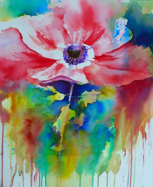
  Can't say the name of the flower but remember it is An Enemy - er really an anenome!  Some spraying technique and then used like like watercolour.  Such vibrant colours.


Just using two colours.  Turquoise and Orange! A tiny bit of  Ultra under and in the boat. Same method as above.

If you haven't heard of Brusho and would like to see it in action, you can find a video by Joanne Boon Thomas on Youtube and many of her painting on google.

Brusho is like dye crystals or ink, like salt, you can sprinkle and spray, use bleach and play with the paint or use like watercolour.  You can get effects with it that you can't with watercolour.  I call it my playtime when I use it.  Originally it was used for textiles.  It is also used in schools as it is non toxic. It does, however, stain your fingers temporarily, so I have to wear an apron, as I am a messy painter at the best of times.

Do check out her lovely work on google images, pinterest or visit www.artybyboon.co.uk.

Saturday, 20 June 2015

NORMANDY HOLIDAY

What a lovely week we had and here are some more memories that I would like to share with you.  All done in a small Khadi sketchbook approx. 6" x 6".  Some w/c and some using various water soluble pens, these pens are the quickest way to do a sketch, well for me anyway.

I said sorry to my hubs, I just have to paint this old mill.  He duly sat patiently while I painted away.  Sometimes he is an angel!

Photo stop at the Normandy Beaches, Omaha beach.  A sculpture in stainless steel,  To me it looks like an explosion.  Such a lovely place.  It is hard to image the carnage that took place there.

Rouen Cathedral.  A lovely medieval city.  Famous to us Brits anyway, as it is where Joan of Arc was burnt at the stake.

A picturesque little place called Les Andelys.  The castle was built by Richard the Lionheart, way back in ancient times. Boy was it hot and hard work walking up that blinking hill!!!

Quick sketch with water soluble pens of a fountain at the Palace of Versailles.  Classical music was playing. A Perfect last sketch and last day in France.

Well I had to paint some food didn't I. Cheese and grapes, just in case you don't know what they are.


Au revoir La Belle France.

Have a lovely weekend fellow bloggers and thank you for dropping in to see me.

Saturday, 13 June 2015

PARIS & NORMANDY

Here's some sketches from my recent visit to France.  I tried to do a sketch a day, however quick. And the equipment I took.  Was in a really happy mood, so each one is a happy memory!  I do try and sit somewhere very discreet as I get all embarrassed if someone is watching me.  Are you the same?


These next three sketches are what I do when I am hanging around


Rouen Cathedral.  This lovely middle age city has narrow street, timber beamed houses and is famous as being the place where Joan of Arc was burned at the stake

Just in case I fancied doing a bigger painting I had a larger pad with me, but didn't use it.  The Khadi pad is really handy and the plastic oil dipper containers for my water.

I wish you all a lovely weekend, see you next week sometime. Au revoir.

Tuesday, 9 June 2015

BONJOUR!!!

Lucky me.  Just come back from a visit to Paris and Normandy.  Highlight was a visit to Monet's Garden.  It has been a dream of mine to visit there.  I wasn't disappointed. We picked a really good time of year to go.  And, of course, I just had to do a quick sketch while there.

Drawn in green water soluble pen.  Quick sketch but the memory will last forever!


Me in action.  Very small notebook in hand and soaking up the atmosphere while sketching.